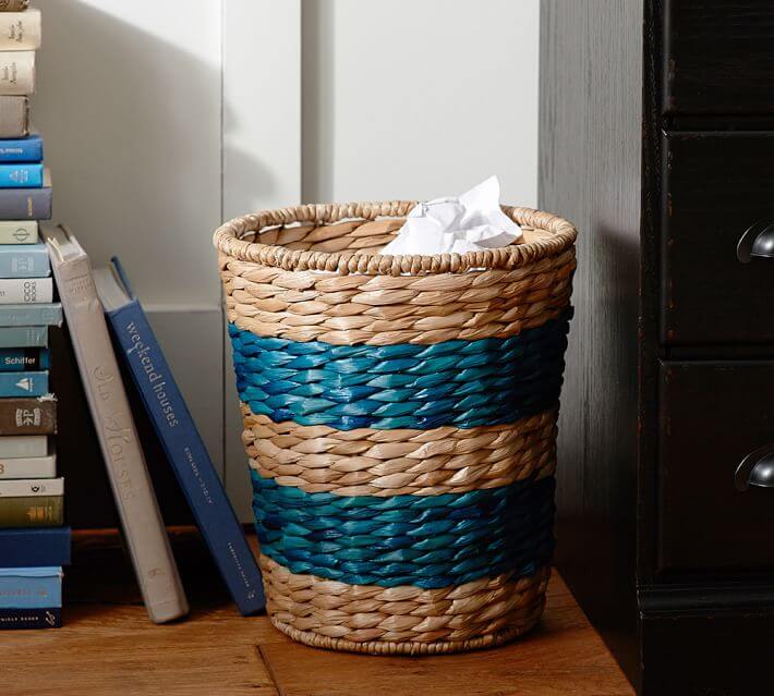
No color screams “summer” more than ocean blue, or, as we’re calling it today, “azure” blue. Think crisp, clean, and cool. It pairs beautifully with white, red, yellow, green and is perfect with warm woods. Classic, yet...
I started working with a new client this week, and our design inspiration is a painting she has with a very southwestern feel, in color and style. She wants to use the picture, but not get stuck in the traditional southwest color palette and design feel. ...
I really had to step out of the box for today’s color feature. Lavender is not in my usual go-to palette, and I honestly don’t know why! It has such a soft, easy feel and goes great with so many colors – gray, chocolate brown, yellows,...
Let’s welcome St. Patrick’s Day with some fresh, emerald green design that is such a welcome change to the grays of winter. In my book, green is a neutral. Walk outdoors and what do you see?? Even in the dead of winter there are still...
Have a case of the “February blues”?? Here are some gorgeous, bright, and cheery blues to warm even the gloomiest February! Blue may be our color for February, but I could use “blue” in any shade at any time of year....
I don’t know, maybe it’s because Valentine’s Day is right around the corner, maybe it’s because everything outside is so gray, but I’ve been feeling “red”! Just that hot, vibrant color brings a smile to my face on these...